Juicy Root: From Farm to Press

Project Overview
CHALLENGE
In the competitive health and wellness space, juice bars often default to similar visual languages like bright colors and generic fruit illustrations that lack differentiation. The challenge here was to explore how a unique brand identity could:
Communicate freshness and natural energy without feeling cliché
Reflect the brand’s vibrant yet grounded personality
Look purposeful across both strategic and applied brand touchpoints
How could we position a juice bar identity that feels grounded and organic? Something that resonates with locals, standout within the wellness space, and works across physical and digital touchpoints?
OBJECTIVES
Demonstrate a full branding process suitable for real client work
Explore multiple logo concepts that express different facets of Juicy Root’s personality
Build a color system inspired by produce and nature that feels both fresh and distinct
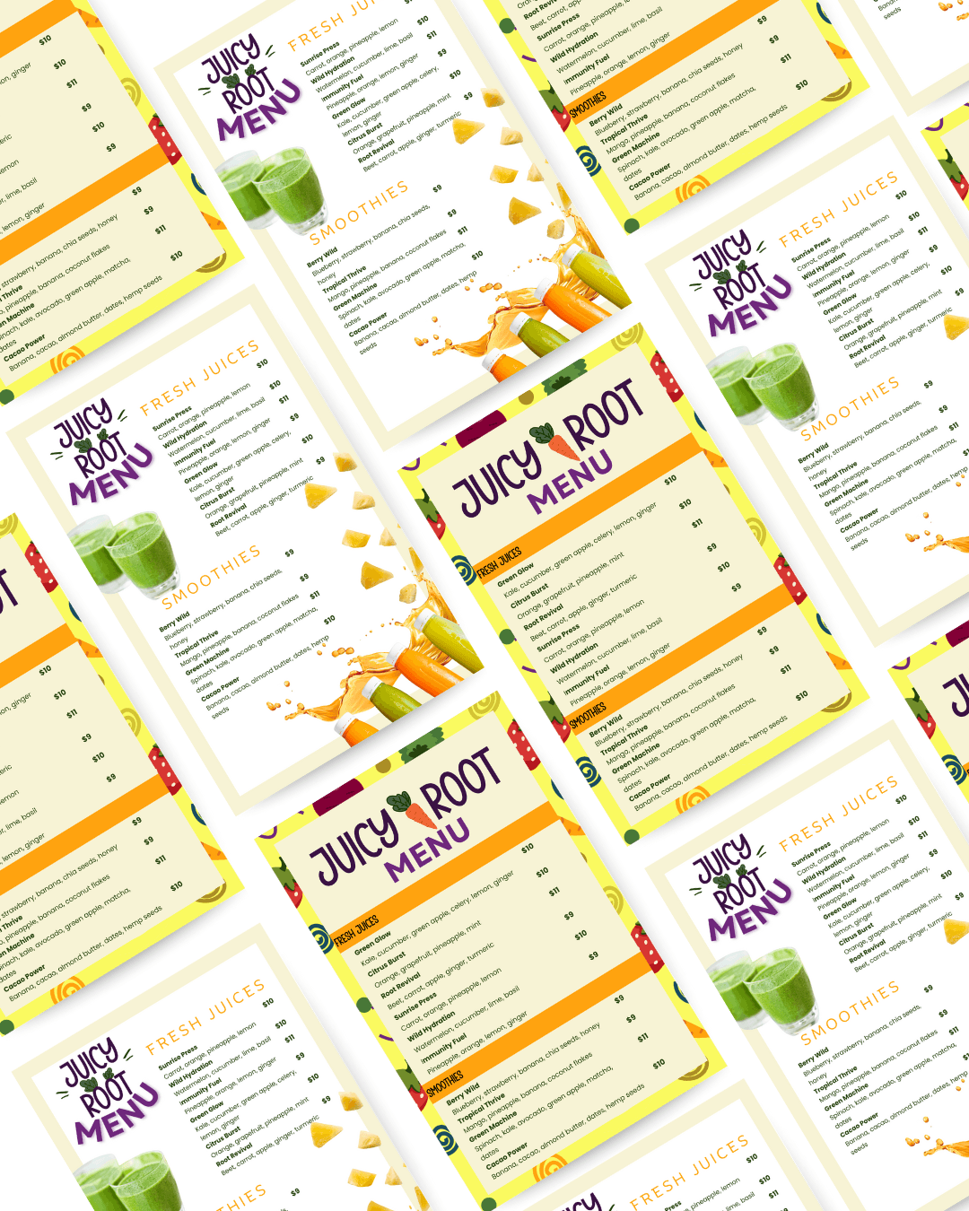
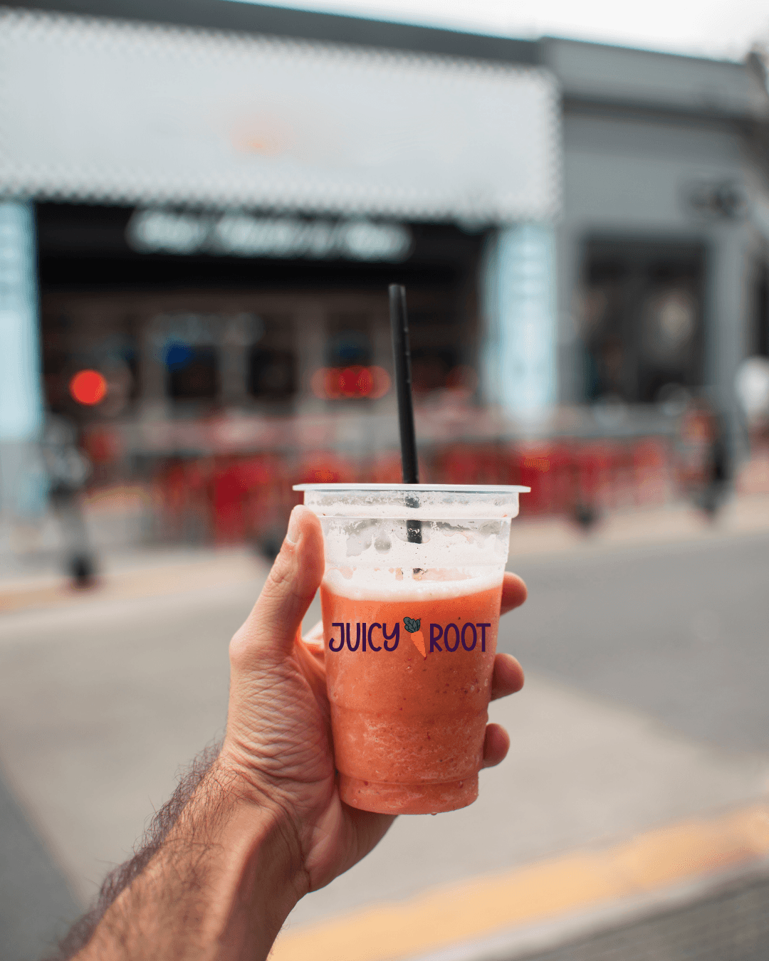
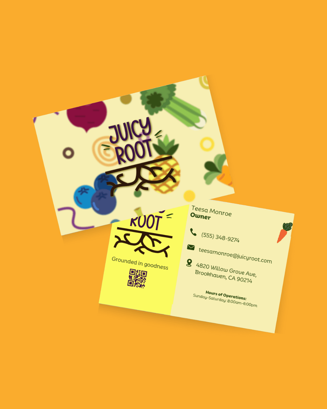
Produce contextual mockups (signage, business cards, digital previews) to show how the brand performs in real applications
STRATEGIC DIRECTION
The strategy focused on translating the essence of fresh, natural, vibrant into a visual language that feels both recognizable and refined. Key strategic decisions included:
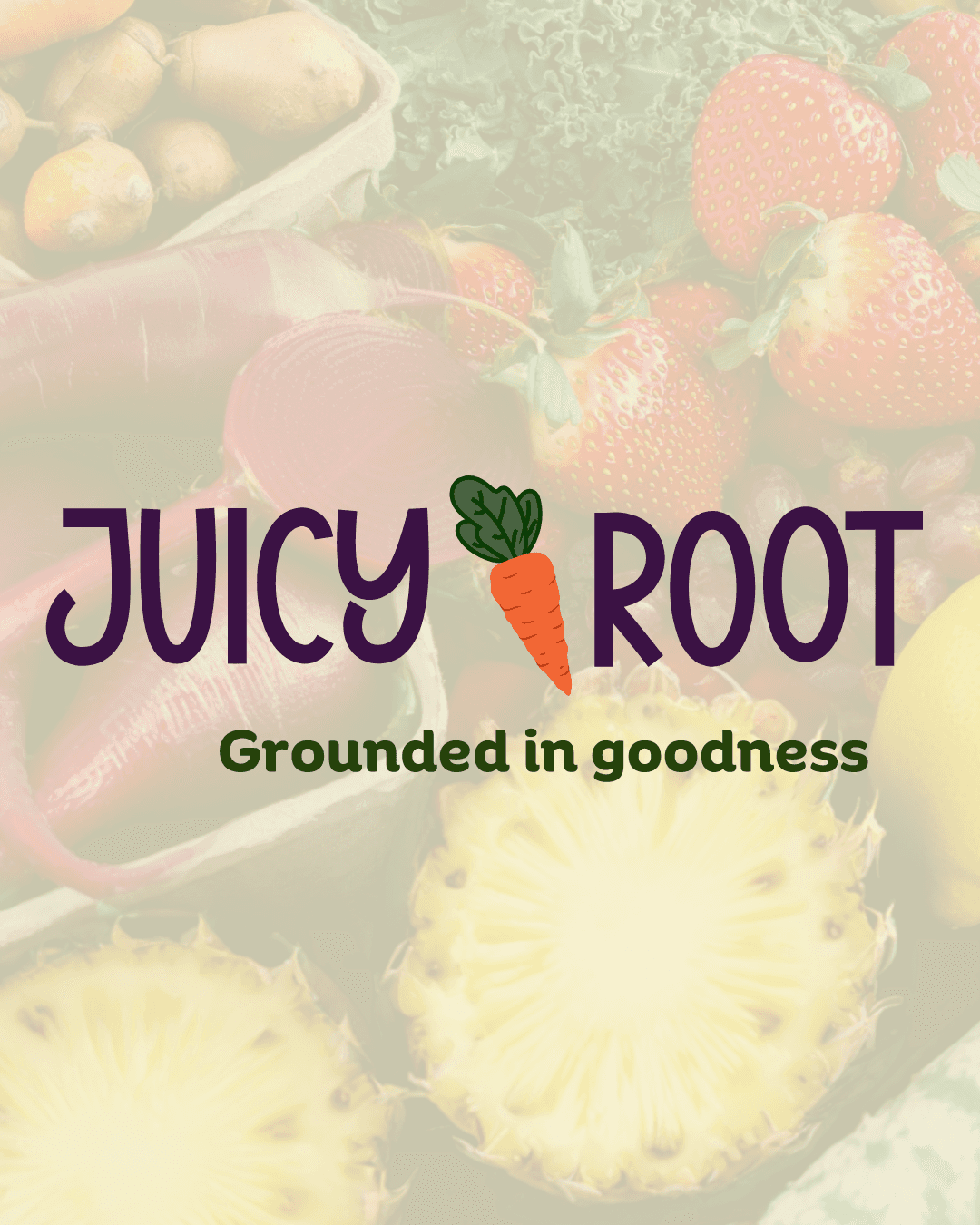
Logo exploration: Creating three distinct logo options to test nuances of brand personality, giving options that ranged from bold and energetic to calm and organic
Color palette: Drawing inspiration from fresh produce to reinforce associations with nature and health
Versatile applications: Thinking beyond the logo to how brand elements could adapt across touchpoints like signage, business cards, and digital mockups
OUTCOME & VALUE
This brand identity captures a bright and fresh visual voice that feels like an exciting experience within the space of wellness allowing for the brand to feel grounded and market-ready.